The Three-Tier Architecture of Poster Typography
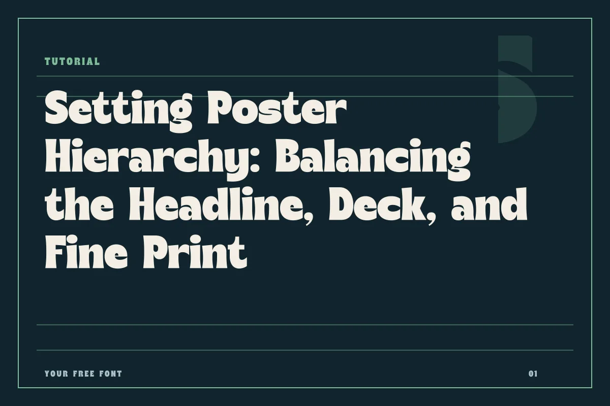
A successful poster communicates in seconds, capturing attention across a crowded concourse or quiet gallery wall. When passersby encounter a printed surface, their eyes require an immediate point of entry followed by an intuitive path of discovery. This spatial communication relies on a three-tier hierarchy: the primary focal line that halts movement, the supporting deck that contextualizes the subject, and the granular utility tier that provides logistical details. Managing these three layers demands more than simply toggling font sizes in an application menu. It requires an intentional balance of scale, weight, rhythm, and negative space so that the layout delivers information effortlessly.
When this balance breaks down, posters quickly become visual white noise. Headline text that lacks sufficient contrast against secondary lines forces viewers to actively decipher which piece of information matters first. Conversely, secondary lines set too small or thin can vanish completely under typical reading conditions. By approaching each tier as an interdependent layer within a cohesive system, you can build dynamic arrangements that hold visual tension while guiding the viewer from curiosity to full comprehension.
Anchor the Eye: Crafting the Primary Focal Line
The primary focal line is the emotional and conceptual hook of the composition. Whether it consists of a single commanding word, an artist name, or a bold event title, it must establish clear dominance over the entire canvas. To achieve this, the scale must be decisive. Modest steps in point size create ambiguity; jumping boldly from body copy to an assertive headline removes all hesitation about where the reading journey begins.
Selecting the right typeface for this focal line depends heavily on the atmospheric tone of your project. A condensed, architectural display face like American Captain projects structural confidence and commands physical presence across wide distances. When a poster requires historical weight or athletic structure, a slab-serif like JACKPORT COLLEGE NCV introduces pronounced geometry that anchors the upper third of a layout with authority.
Display lines also demand meticulous attention to kerning. Automatic metrics often struggle at display proportions, leaving awkward pockets of air around characters with diagonal stems or prominent overhangs. Tightening these optical inconsistencies produces a unified word shape that registers as a cohesive mark rather than a loose assortment of individual glyphs.
Bridge the Gap: Setting a Supportive Secondary Tier
Once the focal line claims the viewer's attention, the secondary tier—often called the deck, subheadline, or supporting line—answers the questions raised by the headline. This layer tells the viewer the theme of the exhibition, the subtitle of the conference, or the venue and date range. The design challenge here is preventing the secondary line from competing with the main headline while keeping it strong enough to resist getting swallowed by surrounding imagery.
To create a natural transition, introduce visual contrast through weight, casing, or stylistic contrast rather than merely tweaking scale. If your focal point utilizes an expressive, athletic silhouette, partnering it with a disciplined sans-serif such as Trench creates a quiet, orderly counterweight. The clean contours and open apertures of a neutral sans let the secondary line deliver context without distracting from the primary display.
Consider these essential adjustments when calibrating your secondary tier:
- Establish clear spatial buffer zones so the deck does not crowd the baseline of the main headline.
- Track out uppercase phrases slightly to improve clarity at mid-range viewing distances.
- Limit the secondary text to two lines maximum to prevent awkward line breaks and visual clutter.
- Maintain a consistent optical weight that visually connects to secondary design elements like rules or date badges.
- Align the deck thoughtfully against the natural grid lines created by the primary title.
Precision in the Margins: Preserving Fine Print Legibility
The bottom layer of the hierarchy comprises the utility text: ticket links, partner mentions, legal lines, physical addresses, and schedule details. Designers frequently treat this text as an afterthought, shrinking it into unreadable corners or scattering it across low-contrast zones. However, if utility text cannot be decoded comfortably, the poster fails its core functional goal.
At small scales, delicate typefaces tend to degrade quickly, especially on textured paper stocks or under dim exhibition lighting. High-contrast serifs lose their hairlines, and tight letter counters fill in. For micro-tier typography, prioritize letterforms built with generous x-heights, robust strokes, and distinct counters. While expressive scripts like Countryside can serve beautifully as isolated signature details or accent flourishes elsewhere on the board, keep your logistical utility clusters grounded in workhorse letterforms designed for pure clarity.
Leading is equally critical in this tier. Cramped lines cause readers to skip rows when reading practical lists or multi-sentence paragraphs. Granting this fine text adequate line height and generous negative margins creates a calm, structured reading pocket that rewards closer inspection.
Stress-Testing the System Across Formats and Licenses
Before sending your poster layout to the print room or exporting it for high-resolution distribution, test the hierarchy under simulated real-world conditions. Step away from your workspace monitor and view the composition from across the room. The focal line should remain distinct and recognizable from twelve feet away, the secondary tier should resolve clearly from five feet away, and the utility cluster should invite close reading without eye strain. You can also apply a heavy blur filter to a duplicate artboard; if the primary and secondary blocks do not hold distinct optical weights through the blur, your contrast ratios need further widening.
Finally, always review the legal permissions for every asset before finalizing your production files. Font usage varies substantially depending on whether your poster serves a community gathering, a cultural showcase, or a commercial marketing campaign. Explore the curated options in the fonts directory, review our complete license guidance, and verify the specific permissions noted on each font page to ensure that your project moves forward on firm ethical and operational ground.