Establishing Clear Functional Roles
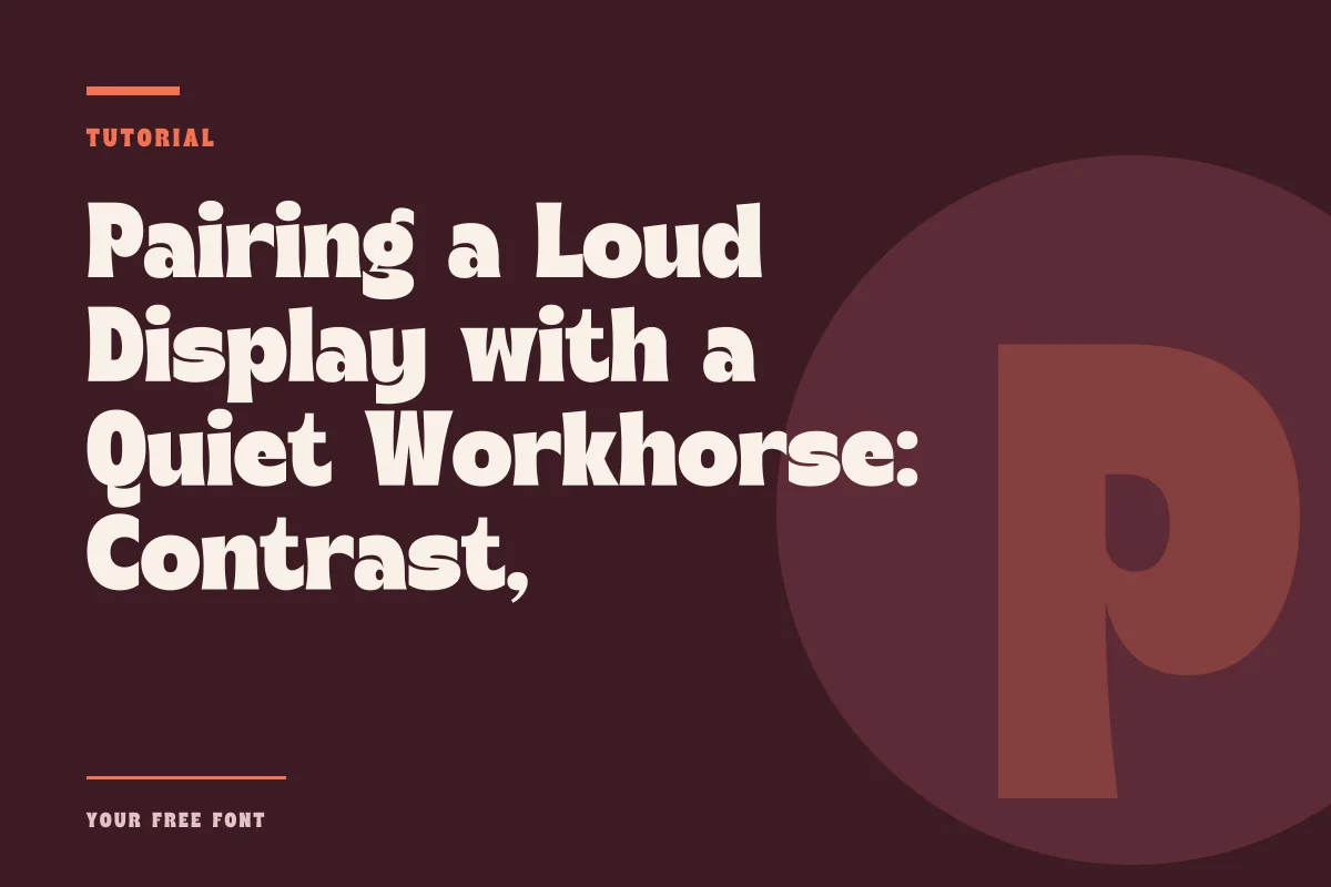
Every pairing starts with a division of labor. When you choose a typeface packed with attitude, flourish, or heavy geometry, you are asking the reader to admire its personality before absorbing its linguistic content. That trade-off works brilliantly for short bursts of text—such as mastheads, posters, packaging titles, and hero titles—but quickly creates eye strain across longer paragraphs. To make the combination succeed, your second typeface needs to step back and prioritize plain legibility above self-expression.
For instance, pairing a punchy headline face like American Captain with a grounded, neutral companion requires accepting that the two fonts will never share the same job. The primary display voice demands attention from across the room, while the body font builds steady, unobtrusive rhythm on the reading surface. When both try to entertain or both refuse to speak up, visual hierarchy collapses.
Before committing to a combination, always consult the exact licensing provisions for your chosen assets. On Your Free Font, each font page provides detailed release information, so review the individual permissions before taking any work into client or commercial production.
Evaluating Structural and Stylistic Contrast
Contrast is what keeps a pairing legible and intentional rather than looking like an accidental substitution. If you pair two faces from the same stylistic territory that share minor differences, the reader senses friction. An all-caps athletic display placed beside an industrial sans serif often clashes because their differences look like errors rather than choices.
To create genuine contrast, change more than just the weight or style tag. Look at the structural skeleton:
- Stroke Modulation: Match a monoline display title against a serif with visible thick-thin modulation to produce clear tactile separation.
- Geometric Construction: Offset rigid, mechanically built titles with humanistic body forms that contain natural pen ductus and open counters.
- Proportions: Anchor tall, condensed capitals against normal or slightly wide running text to emphasize verticality where it belongs.
- Texture and Texture Grain: Balance textured or distressed lettering with crisp, sharp vector edges in the supporting captions and decks.
By defining differences across geometry and construction rather than just point size, you avoid the trap of hesitant, middle-ground pairings that fail to guide the reader's eye.
The Critical Role of x-Height and Optical Scale
Even when a pairing looks striking in thumbnail previews, physical friction often emerges during typesetting because of mismatched vertical proportions. The x-height—the relative height of lowercase letters like x, o, and u compared to uppercase capitals and ascenders—governs perceived size more than nominal point size ever does.
When a display font features a towering cap height and diminutive lowercase characters, it commands substantial vertical authority. If you position it alongside a body typeface designed with an enormous x-height, your body text will appear optically heavier and visually louder than intended at standard reading sizes. To maintain balance, compare how both fonts carry visual mass across the baseline.
Do not rely solely on point size sliders inside design software. A 14-point body face with an expansive x-height can easily swallow an adjacent 24-point display title if the stroke widths and open spaces conflict. Always test headlines, subheadings, and multiple continuous sentences simultaneously, calibrating leading and tracking until the body copy settles into a quiet grey tone underneath the display anchor.
When the Pairing Breaks Down
Pairings typically fail not because either typeface is defective, but because their visual energies cancel each other out or create unintended dissonance. Diagnosing early friction helps you discard weak pairings before building complex templates.
Competing Gestures and Details
The most common failure occurs when both typefaces attempt to be expressive in opposite directions. If your display choice features sweeping swashes or idiosyncratic terminals, placing it above a deck set in an eccentric geometric grotesque will cause visual clutter. The eye searches for a stable horizon and finds two distinct voices shouting over each other. If your headline carries decorative flair, your text companion should remain structurally quiet.
Mismatched Optical Densities
A second recurring issue is mass imbalance. An ultra-dense, solid display title paired with a hairline text weight creates a visual cliff: the eye drops from the heavy headline and loses tracking completely in the wispy reading lines. Conversely, a light display script paired with an over-inked, chunky sans serif flips the hierarchy, turning the secondary copy into an accidental focal point. Test your layout by stepping back several feet or blurring your vision slightly; the headline should lead, the narrative should follow, and the layout should feel anchored.
Testing Pairings in Real Reading Environments
A pairing cannot be evaluated in isolation against a blank canvas. True typographic rhythm proves itself only when stressed by actual editorial constraints: varying line lengths, numbers, symbols, and unpredictable word patterns. Copy and paste genuine draft content into your working layout rather than comfortable dummy text, and review how headings break across small mobile viewports as well as large spreads.
Explore different approaches across the curated collections on staff picks, noting how skilled designers consistently tame expressive lettering with orderly editorial systems. When you control contrast, balance vertical proportions, and give your body text room to breathe, even the loudest display voice finds comfortable harmony on the page.