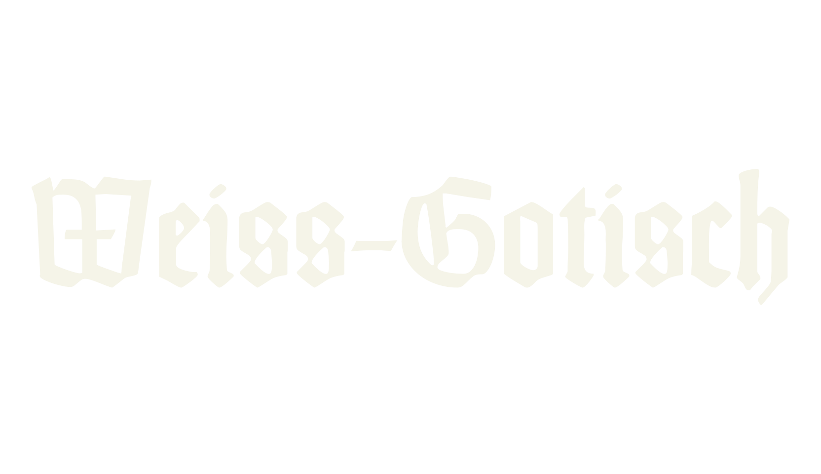
Weiss-Gotisch is a broken-script blackletter in the style Emil Rudolf Weiss drew for early 1900s book printing: tall, narrow, upright letters with a quiet, dignified rhythm, like text from an old church book or a classic edition of German poetry.
It reads more calmly than the heavy gothic types — this one is for literature, certificates, and elegant old-world headlines, not horror posters.
One thing to know: the numbers were drawn as plain upright figures, so a date set in this font will look simpler than the letters around it.
The font also hides a set of traditional German print features on Alt-key codes — the old long-s, joined letter pairs like ch and ck, and alternate capitals — documented in the readme that ships with the font.