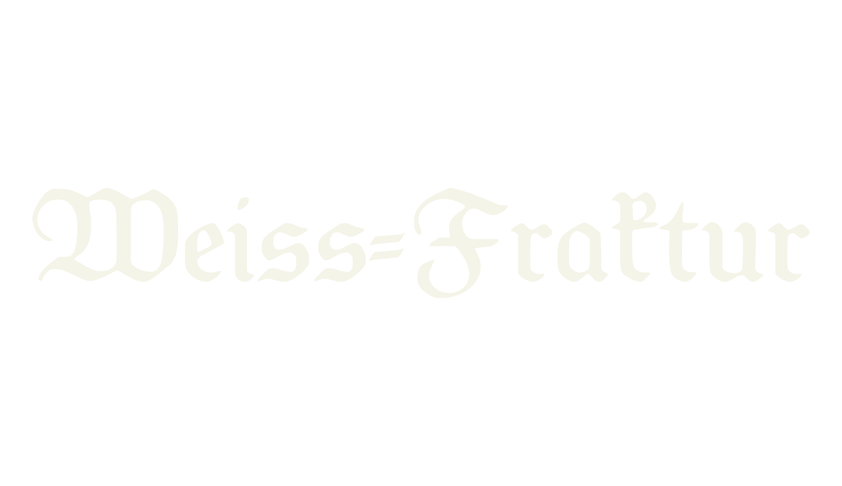
Weiss-Fraktur is Emil Rudolf Weiss's elegant take on the German fraktur: light, open, and flowing, with curving lower-case letters that look like they were written with a broad pen held at a slant.
The capitals are decorative but graceful, not heavy.
This is the fraktur you pick for wedding stationery, book titles, wine labels, and anything that should feel refined and old-European rather than dark or gothic.
One quirk: the numbers were drawn as plain upright figures, so they sit a little simpler than the letters around them.
Umlauts and the ß are all drawn to match the style.