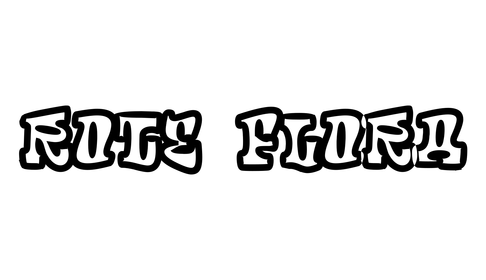
Tip Top is a fun one — and despite what the tags say, it is not a blackletter at all.
It's a fat, bulbous display face with swollen rounded letters in the playful turn-of-the-century Jugendstil manner: think circus posters, vintage candy packaging, and groovy 1970s revival lettering.
The letters are thick and soft with bouncy curves, and it reads as joyful and retro rather than dark or gothic.
It works for party invitations, cartoon-style logos, candy and ice-cream branding, and anything that should feel round and cheerful.
A bit of history from CybaPee Creations, folded in from the page's existing notes: Tip Top was released around 1900 by Julius Klinkhardt of Leipzig.
This digitization is based on a scan from the book "Lettera 3" (Arthur Niggli Ltd., Switzerland, 1968), where the face is wrongly called "Teutonia" by Roos & Junge.
Thanks to Bernhard Schnelle (Hochschule für Bildende Künste, Braunschweig), who tracked down a reprint of the "Schriften-Atlas" (Petzendorfer, Hannover, 1999), the error was corrected and the face renamed to Tip Top.