If you're a big Nine Inch Nails fan then maybe you'll recognize this.
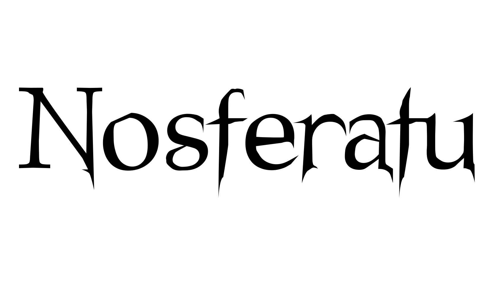
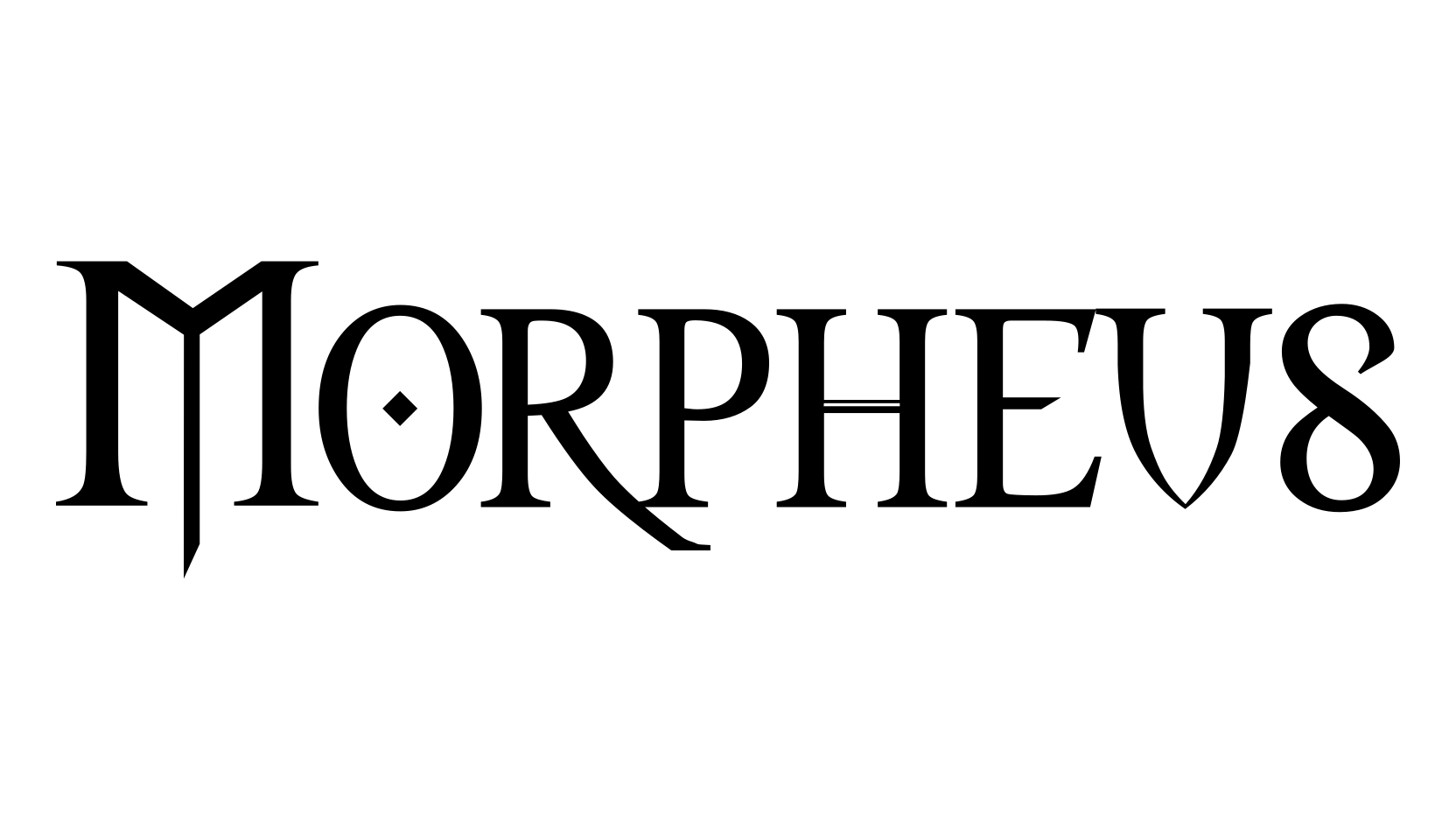
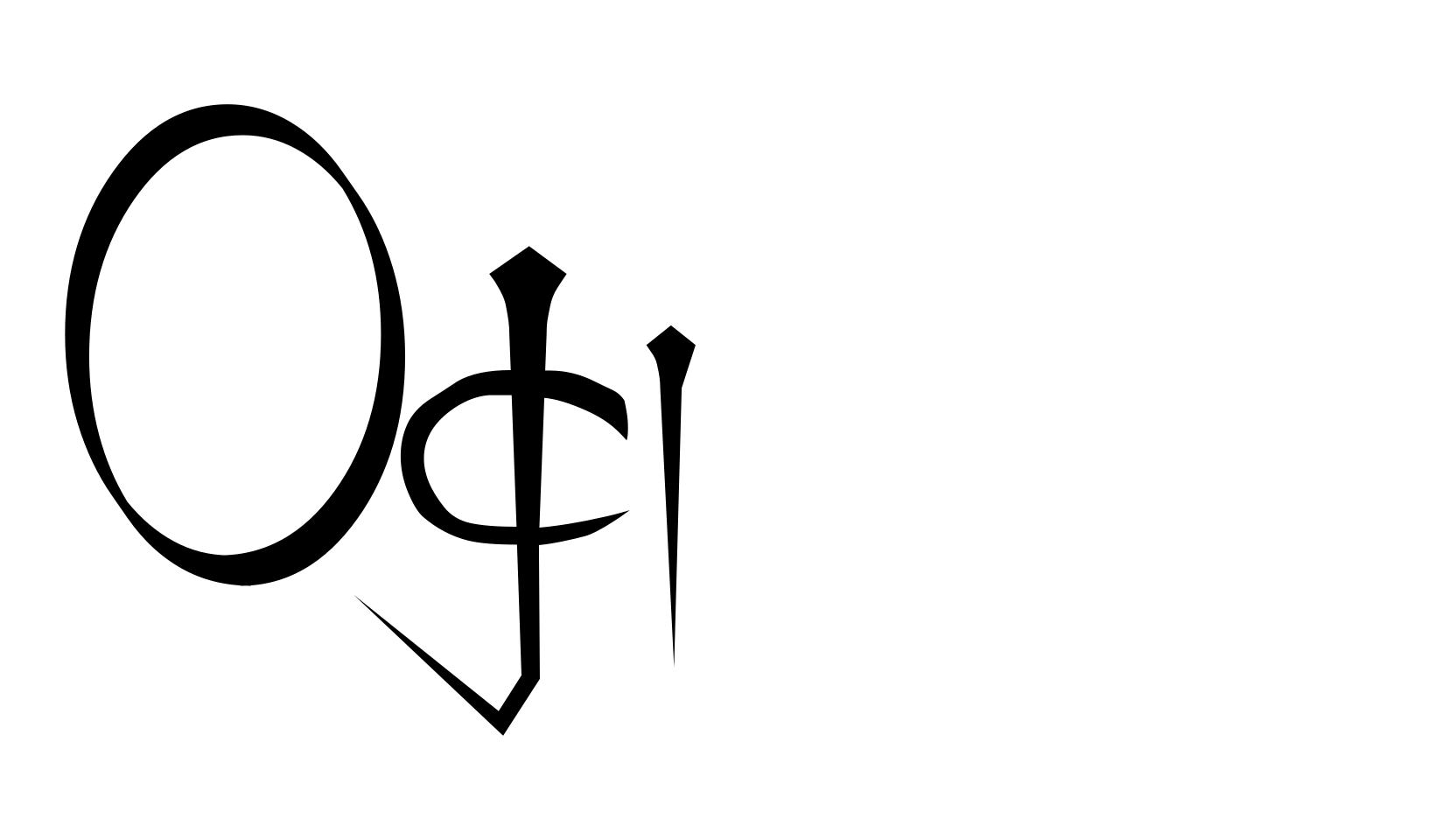
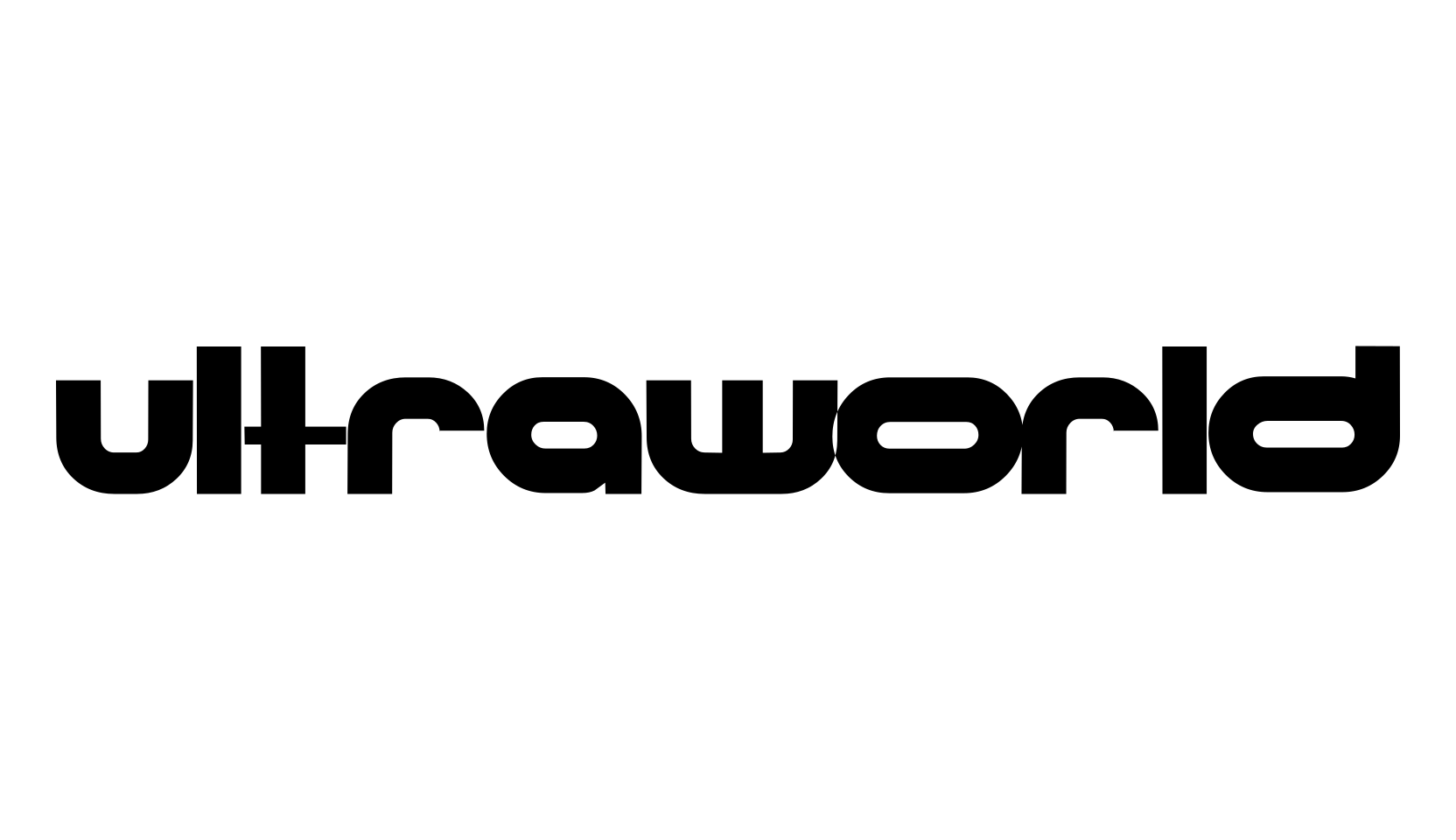
The single for the song "Sin" had a post-modern deconstructionist pseudo-gothic (or something) font used for writing the word "Sin" and the acronym "NIN." I was kinda bored, thought it looked kinda cool, and decided to extrapolate an entire font from it.
Some characters worked better than others, but the general effect is there.
It should make a kind of interesting gothic-type font; I wouldn't go off and write any business letters with it.
It's just for fun, really.
This is, by the way, the second revision of this font, with slightly cleaner generation and extra characters.