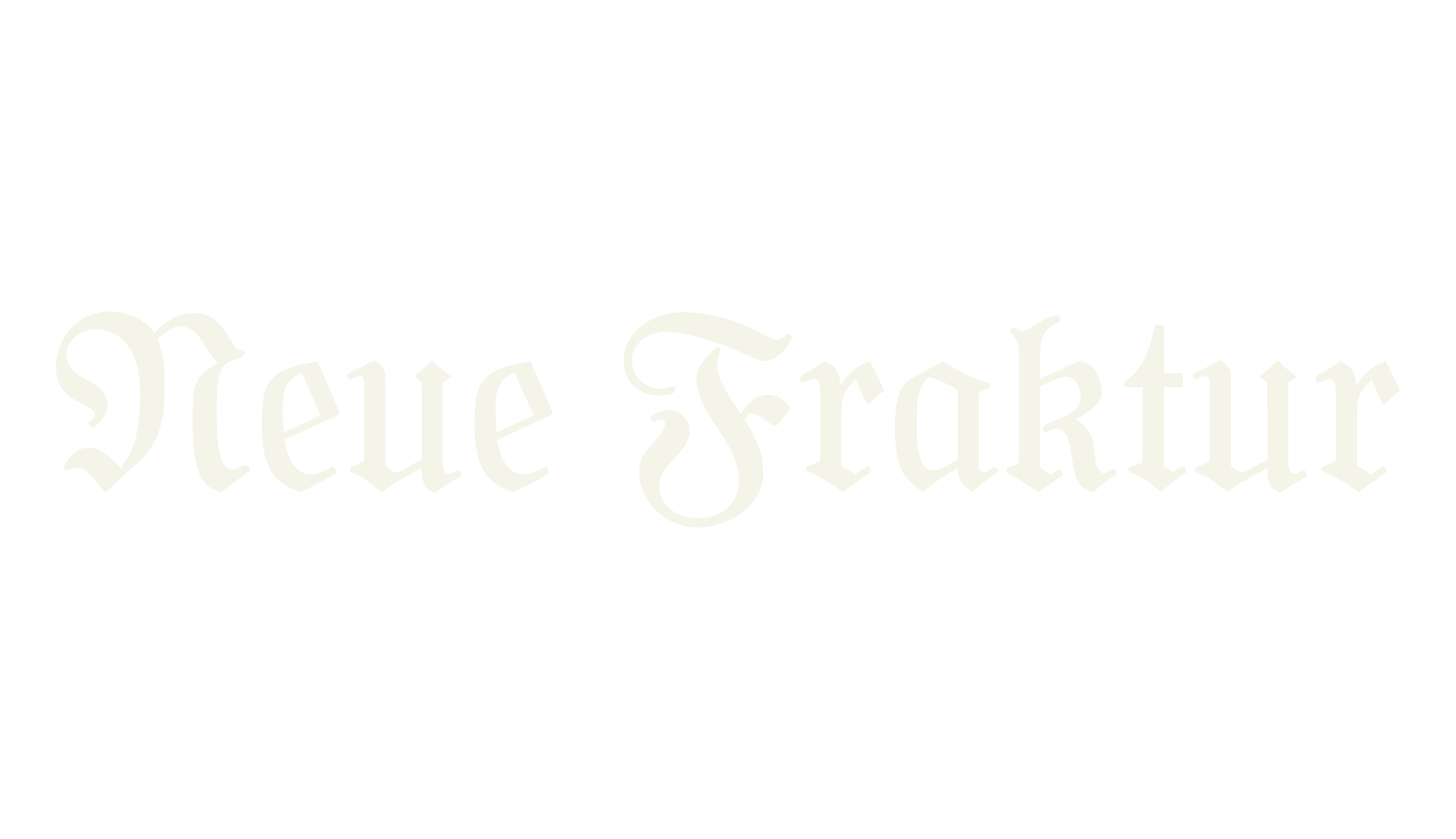
Neue Fraktur is a light, elegant fraktur with an open, airy feel — the broken-script letters are drawn with fine pen strokes and plenty of white space, so it reads much more gently than the heavy gothic types.
The small letters flow like handwriting with a broad pen, and the capitals have a graceful, calligraphic sweep.
It fits book titles, wedding stationery, wine and coffee branding, and refined old-European design.
The font hides a set of traditional German print features behind Alt-key codes — the old long-s, joined letter pairs like ch, ck, and tz, and an alternate simple z — documented in the readme that ships with the font.
One quirk: the numbers are plain upright figures rather than fraktur, so they'll sit a little simpler than the surrounding text.