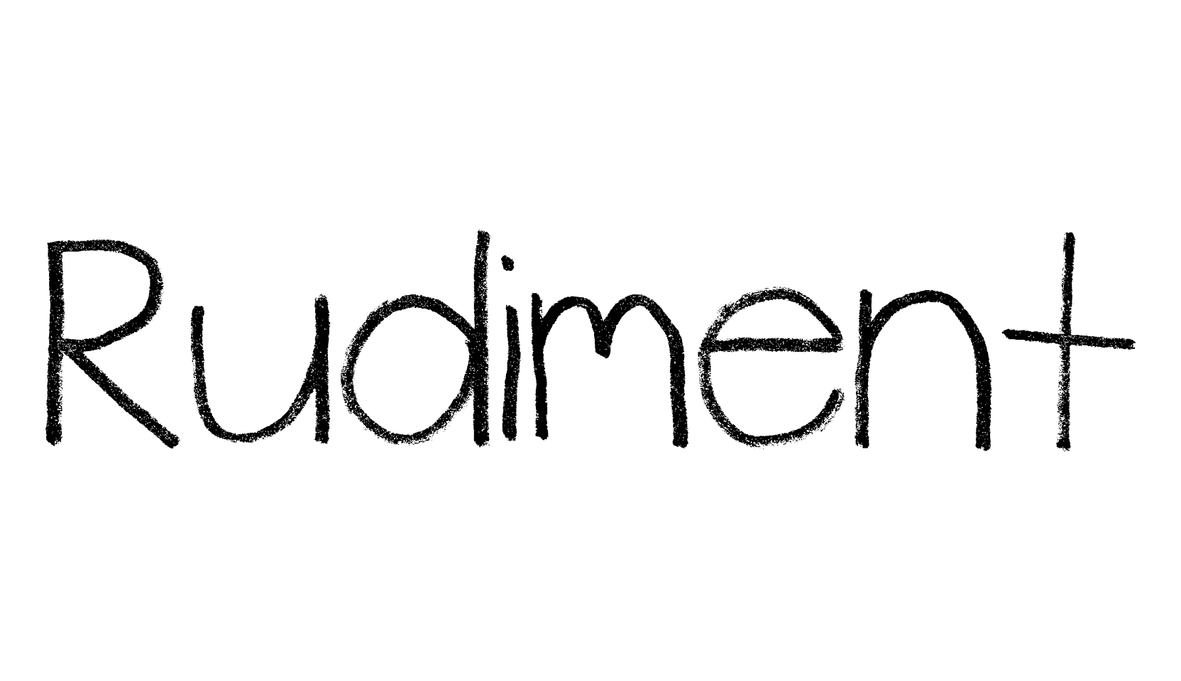
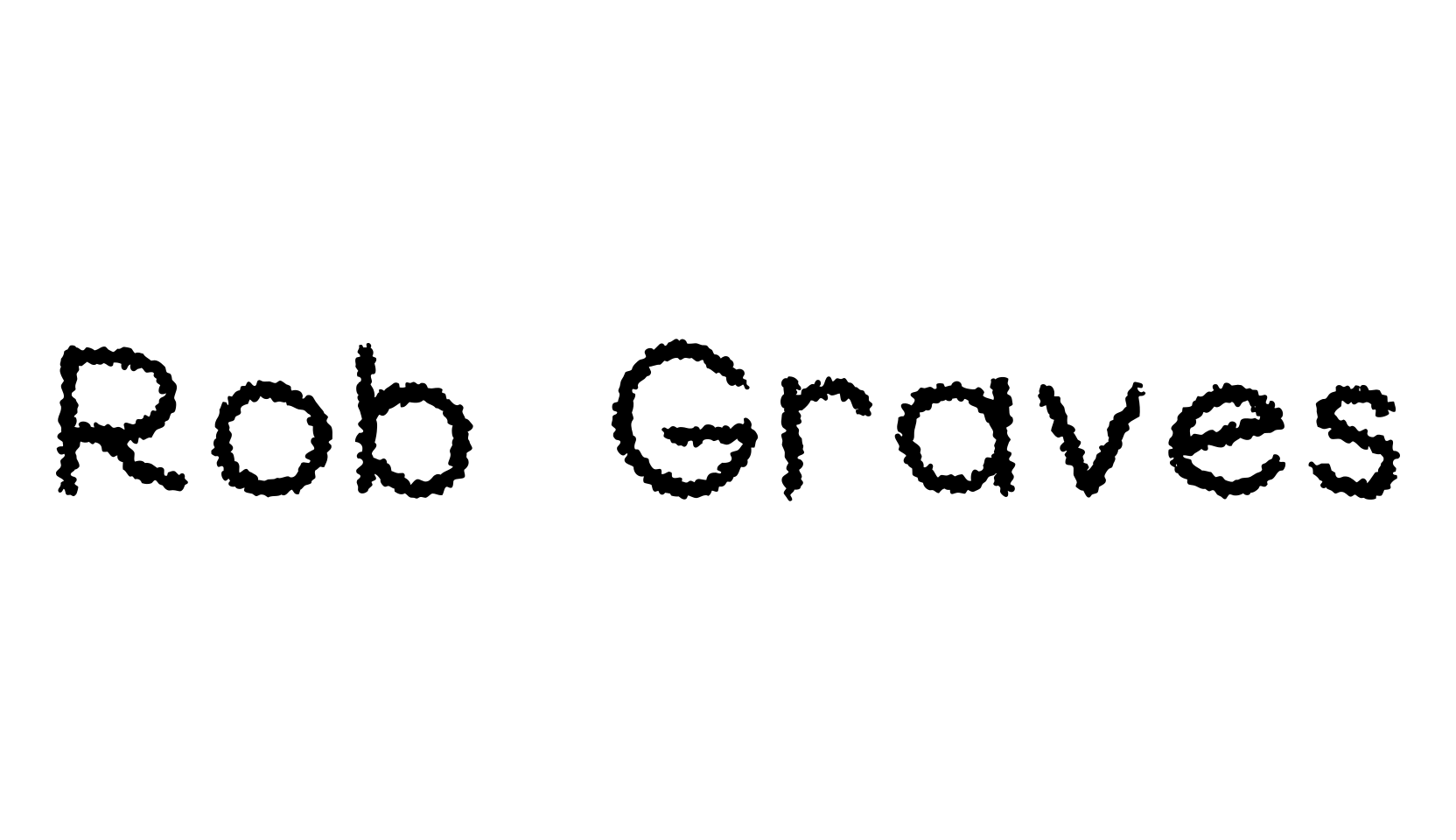
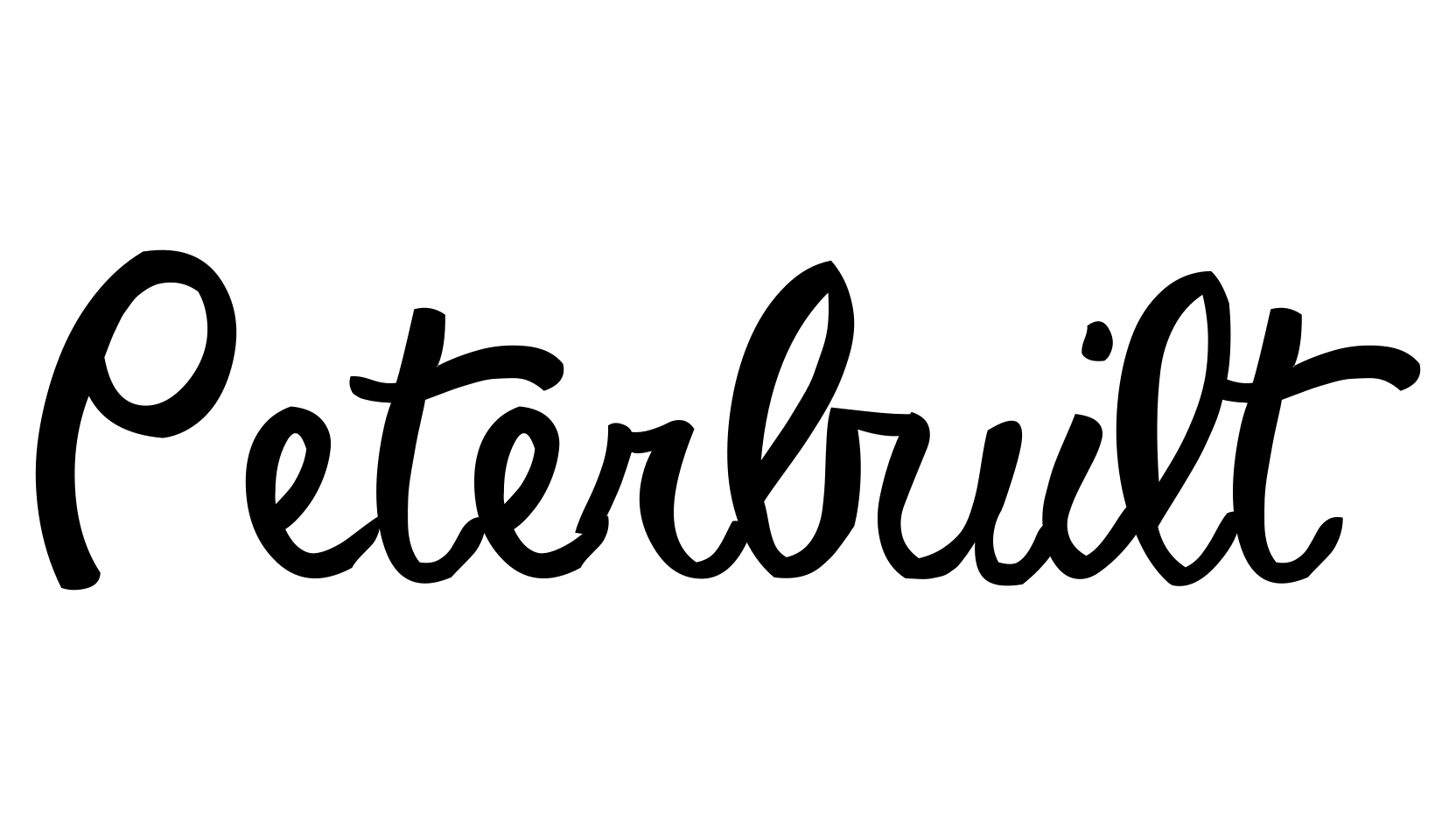
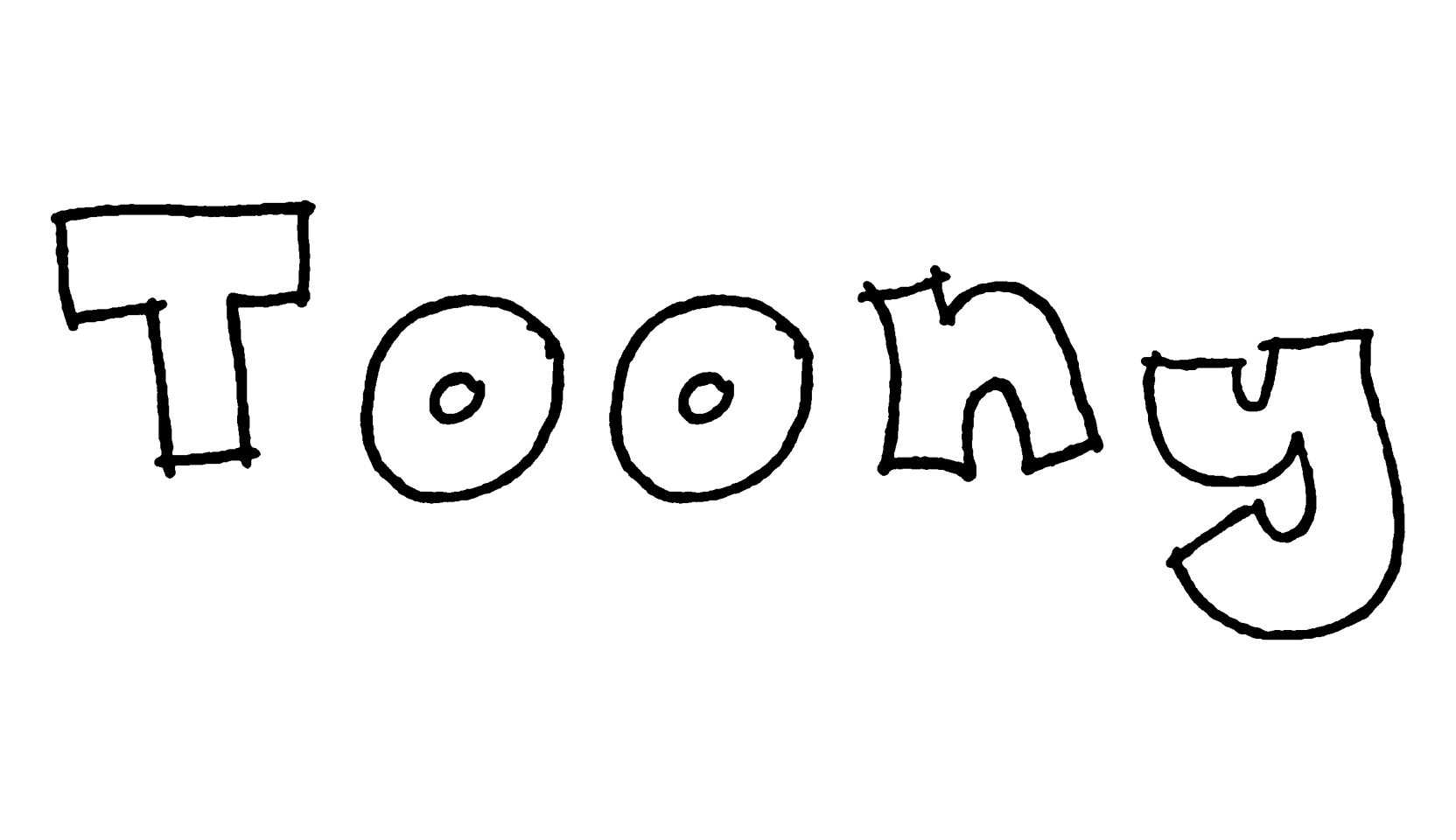
Mostly Mono is a skinny, hand-drawn font that looks like careful print writing — neat, rounded letters drawn with one light line, like the lettering on a chalkboard menu or a school worksheet.
Almost every letter and number is exactly the same width (that's the "mostly mono" part — only the punctuation varies), so it works nicely for lists, labels, and anything where a friendly, tidy look helps.
It's a complete font with letters, numbers, and punctuation, and it's free for both personal and commercial projects.
From the designer: freeware by Kevin Richey, 2009 — free for commercial and non-commercial use.