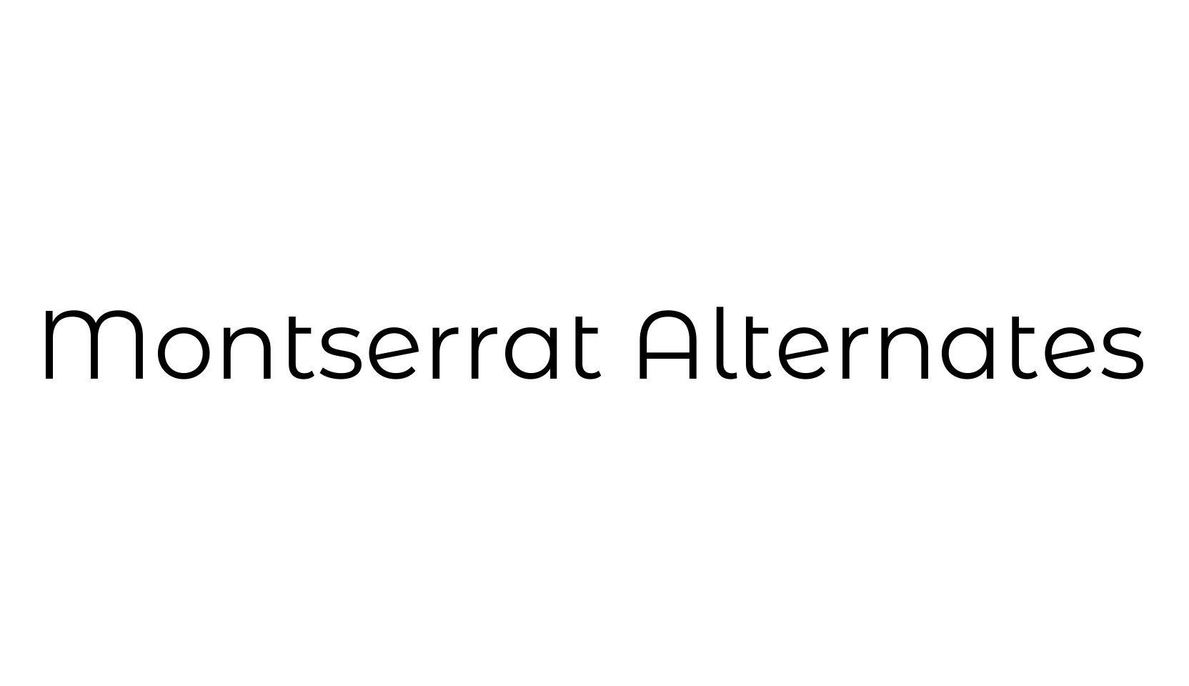
The old posters and signs in the traditional neighborhood of Buenos Aires called Montserrat inspired me to design a typeface that rescues the beauty of urban typography from the first half of the twentieth century.
The goal is to rescue what is in Montserrat and set it free, under a free, libre and open source license, the SIL Open Font License.
As urban development changes this place, it will never return to its original form and loses forever the designs that are so special and unique.
To draw the letters, I rely on examples of lettering in the urban space.
Each selected example produces its own variants in length, width and height proportions, each adding to the Montserrat family.
The old typographies and canopies are irretrievable when they are replaced.
There are other revivals, but those do not stay close to the originals.
The letters that inspired this project have work, dedication, care, color, contrast, light and life, day and night!
These are the types that make the city look so beautiful.
This is the Regular family, and it has two sister families so far, Alternates and Subrayada families.
Updated in 2017:
Version 7.200
Google commissioned Jacques Le Bailly @fonthausen to do an extensive revision of the latin character set.
We applied a new weight distribution across the variables.
Now Montserrat has extended Cyrillic support (GF Cyrillic Pro).
Google Fonts: https://fonts.google.com/specimen/Montserrat
Elsewhere: https://www.typewolf.com/site-of-the-day/fonts/montserrat , https://www.fontsquirrel.com/fonts/montserrat , https://www.1001fonts.com/montserrat-font.html
Free download includes all 18 styles — Thin through Black with matching italics — under the SIL Open Font License.