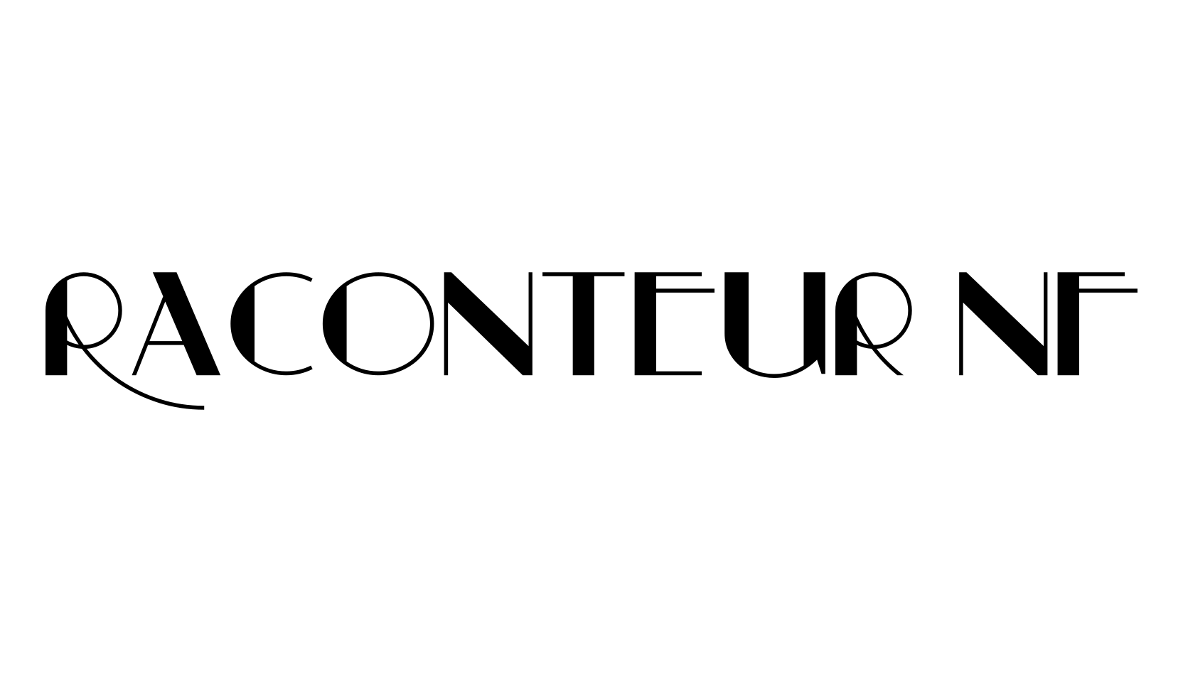
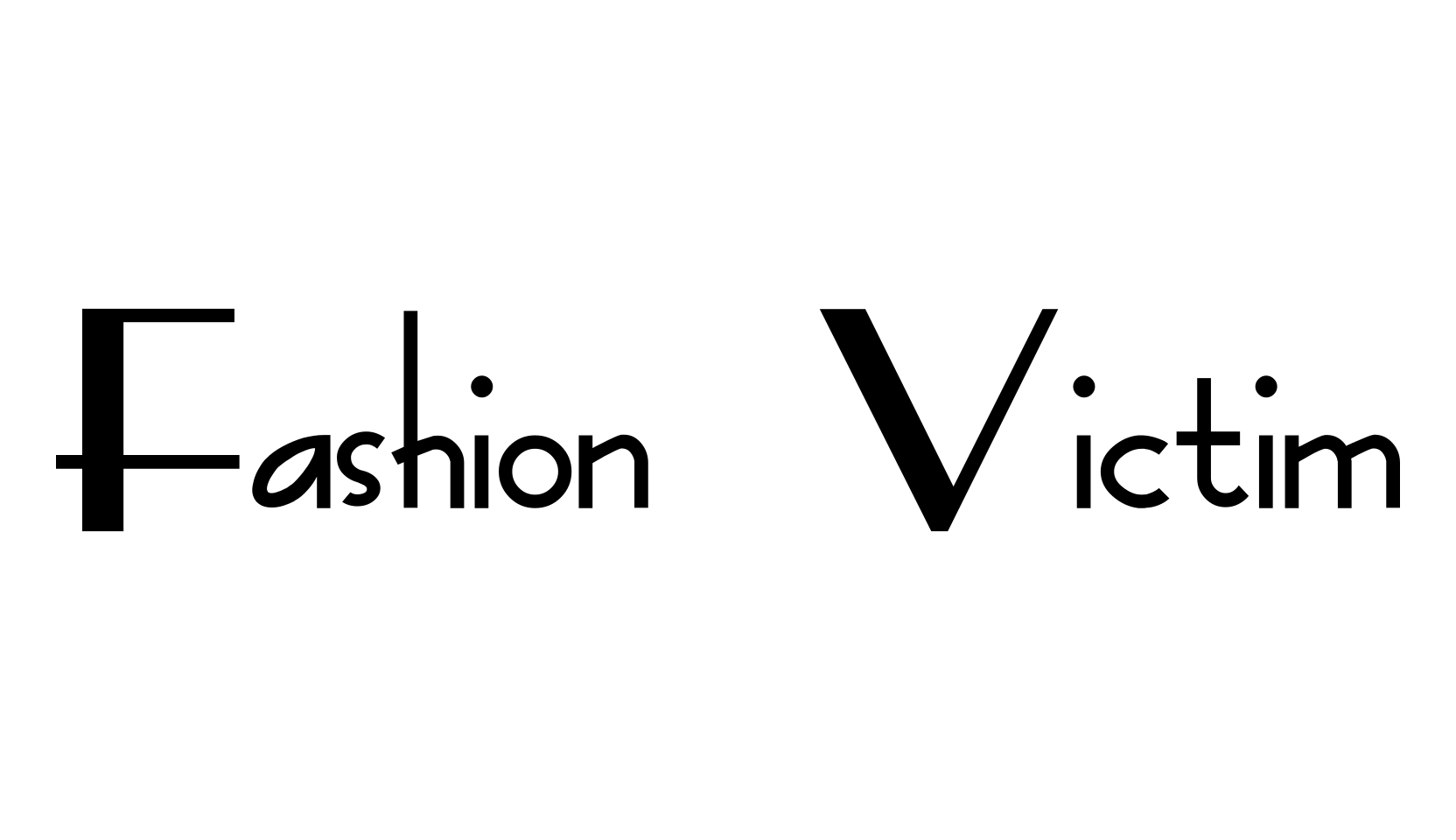
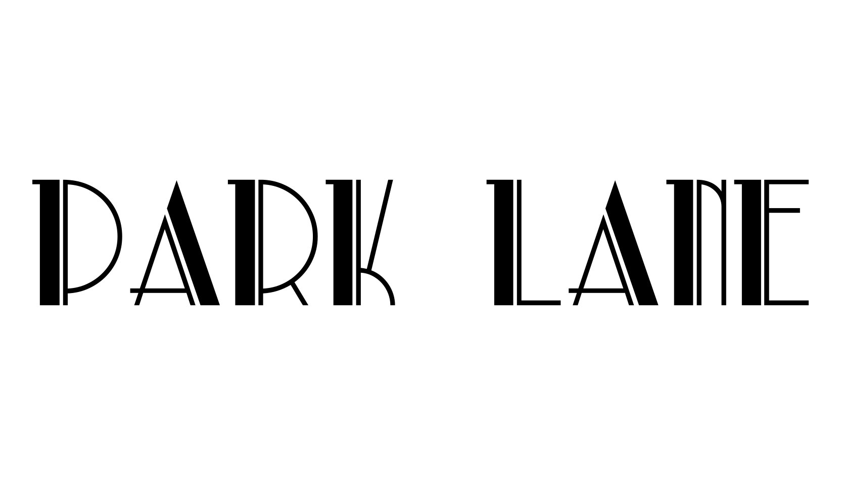
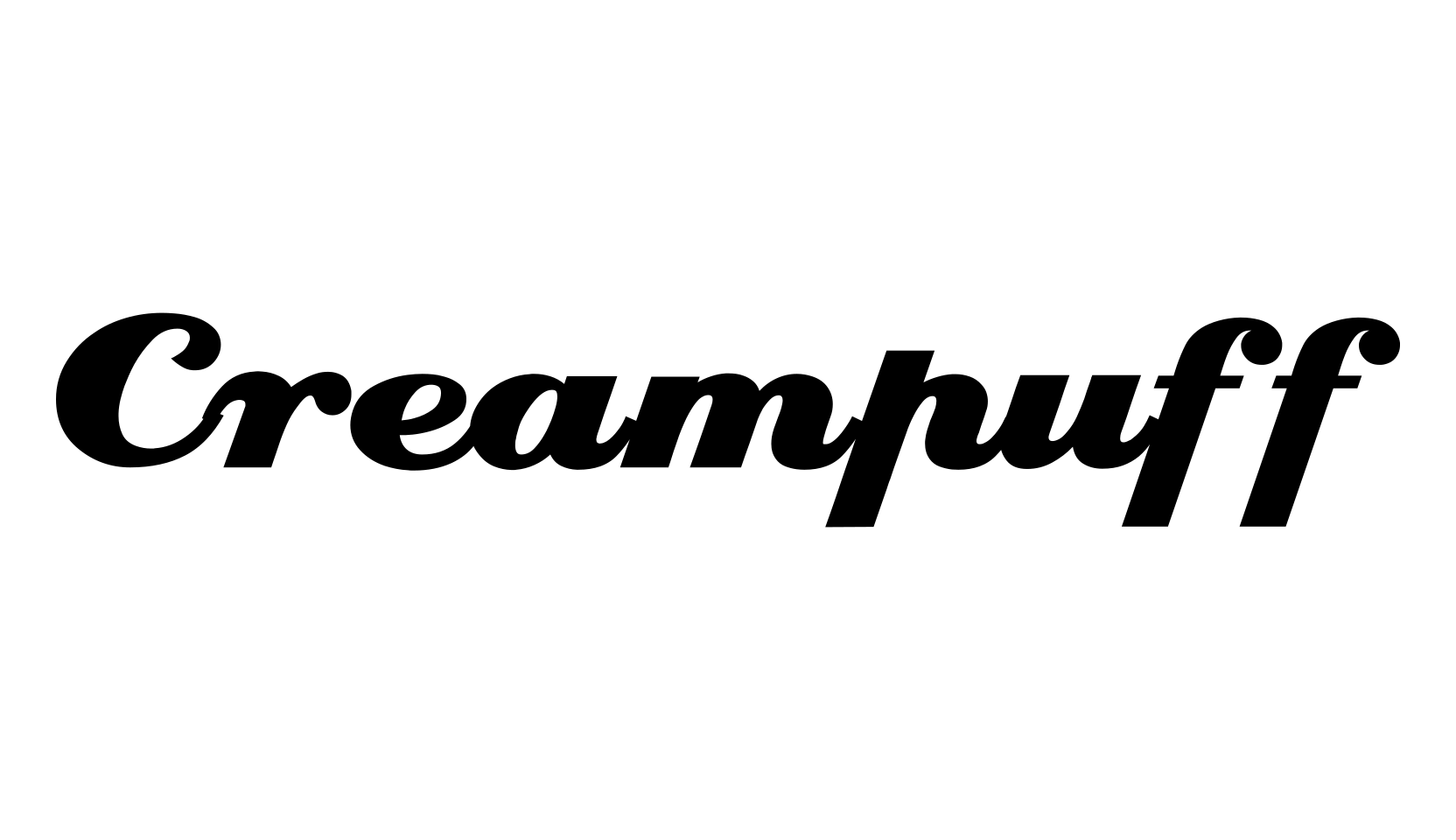
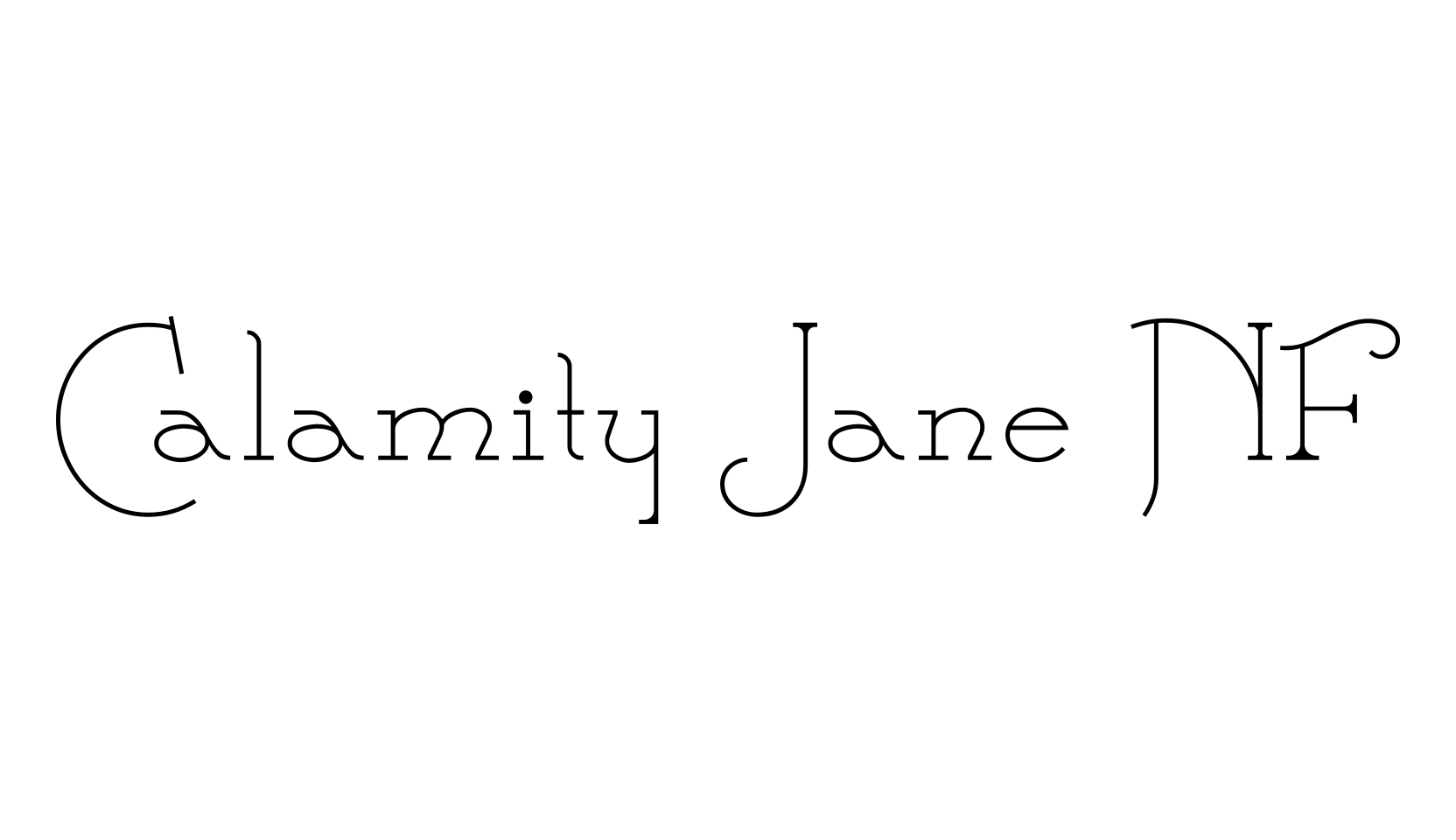
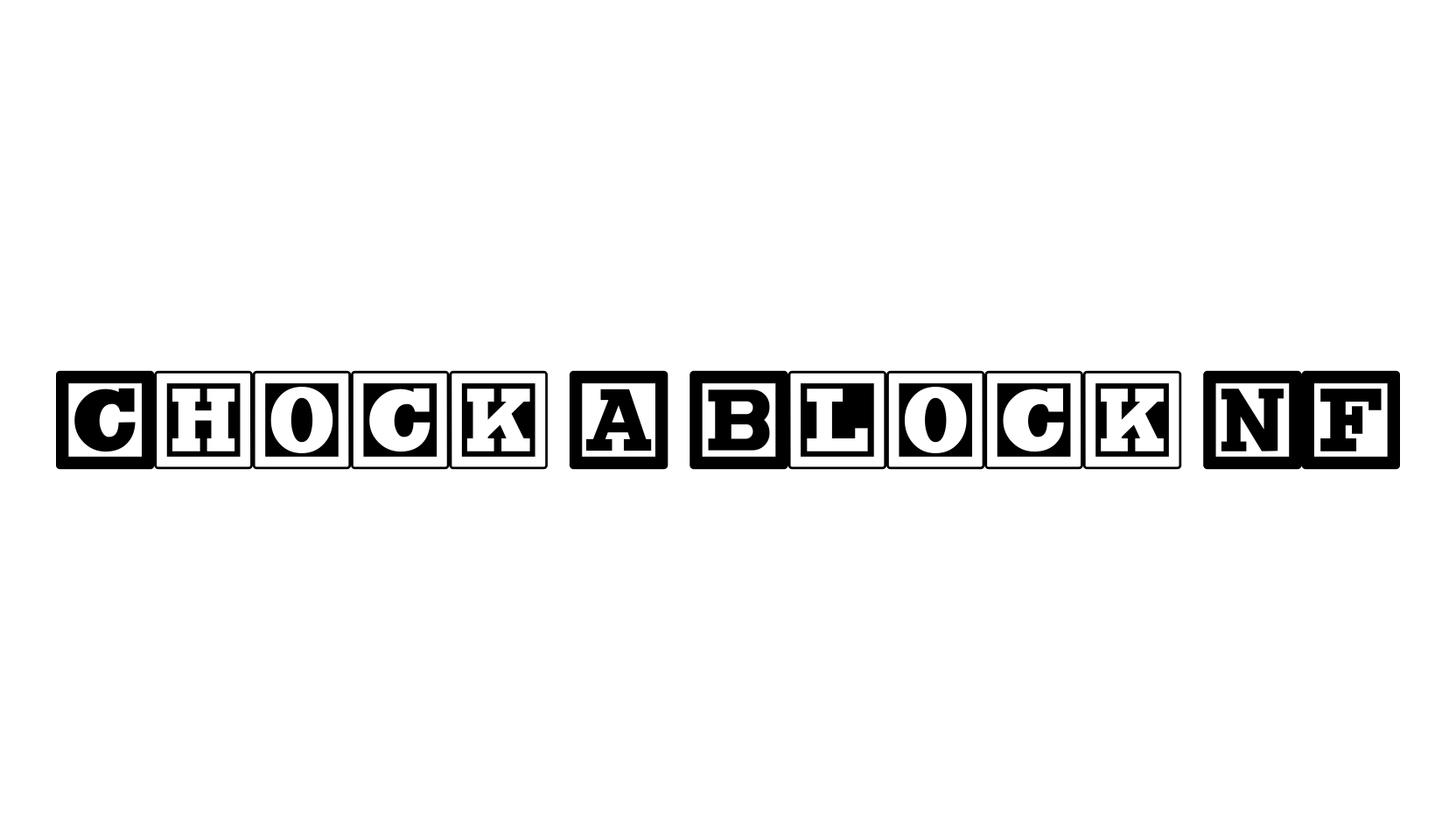
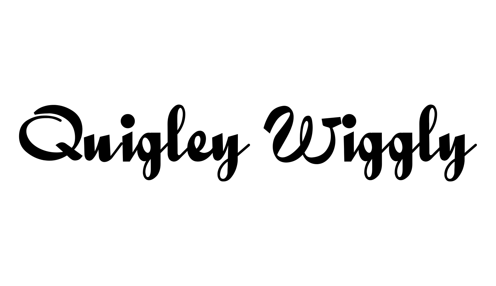
Here’s a strange hybrid: I took the lower case from the formal script font Stuyvesant, straightened out its rather extreme 22° slant, and combined them with caps from the font Bellevue, again making them upright, and adding an inline effect.
The result is a font that flows very nicely, with a nice balance between clean lowercase characters and swashy caps.
Thanks to Deb Dunbar for naming this font.