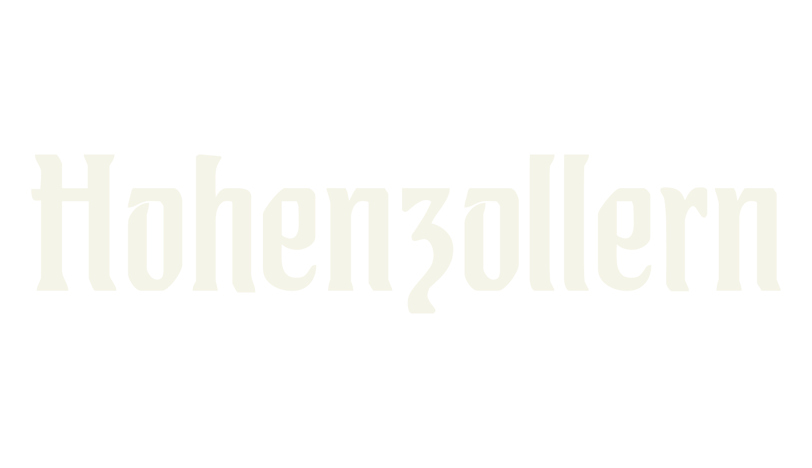
A tall, narrow textura — the letters are slim and stand straight up, which gives text a stately, banner-like column.
Per the page's own history (Christopher Burke on German hybrid typefaces), Hohenzollern belongs to the group of German hybrid faces made between 1900 and 1914, mixing roman and gothic forms in the Jugendstil manner.
It was designed by Carl Albert Fahrenwaldt (1864–1941), who also cut a fat version called Imperial.
Works for book titles, newspaper nameplates, and anything needing a formal German-historic voice.
Includes A–Z, a–z, and 0–9.
The characters [ \ ] ^ _ ` { } and ~ are missing from the font.