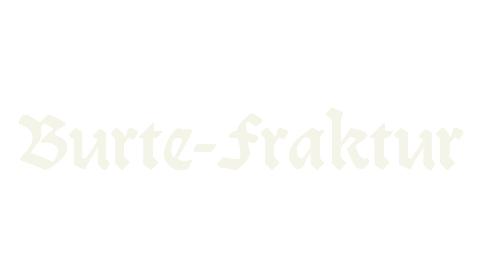
Burte-Fraktur is a classic German fraktur text face, cut in 1928 for the Mainzer Presse by Gustav Eichenauer, Rudolf Koch's favourite punchcutter, to a design by C.H.
Kleukens.
The lowercase letters have the familiar broken strokes and sharp angles of 1920s German book printing, with tall, elegant capitals.
It keeps period details: a long s and the traditional ch, ck, ff, ft, fi, and fl letter pairs are included for authentic-looking German text (the readme lists Alt codes to reach them).
The original capital S was redrawn for this digitization because it looked too much like a modern G and hurt readability.
Covers A–Z, a–z, 0–9 and basic punctuation; missing # $ % > [ \ ] ^ _ ` ~.