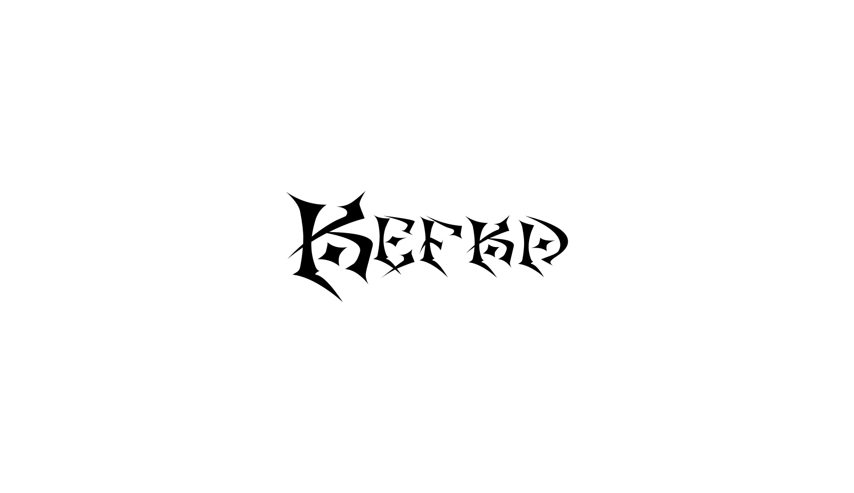
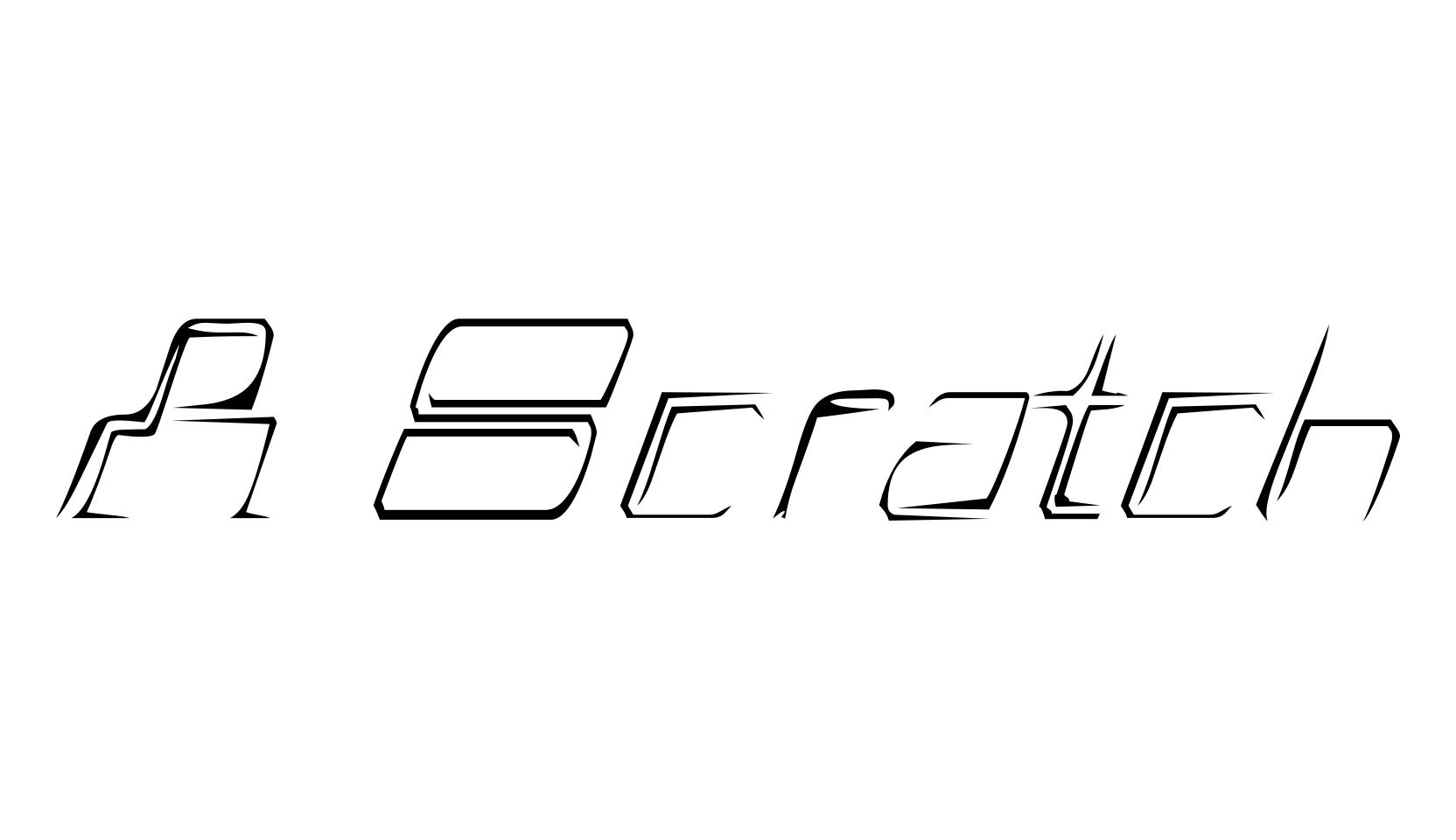
In the beginning, my idea for the font was totally different.
I wanted to create a font with grid lines that used arcs instead of diagonal lines.
To my surprise it turned out looking like a bauhaus monstrosity.
Sigh.
Now I understand the whole f****** bauhaus font idea.
Damn they rock.