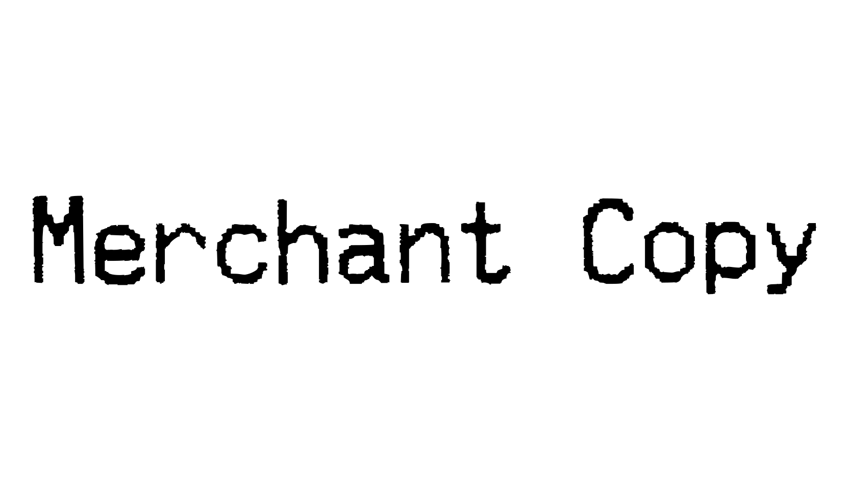
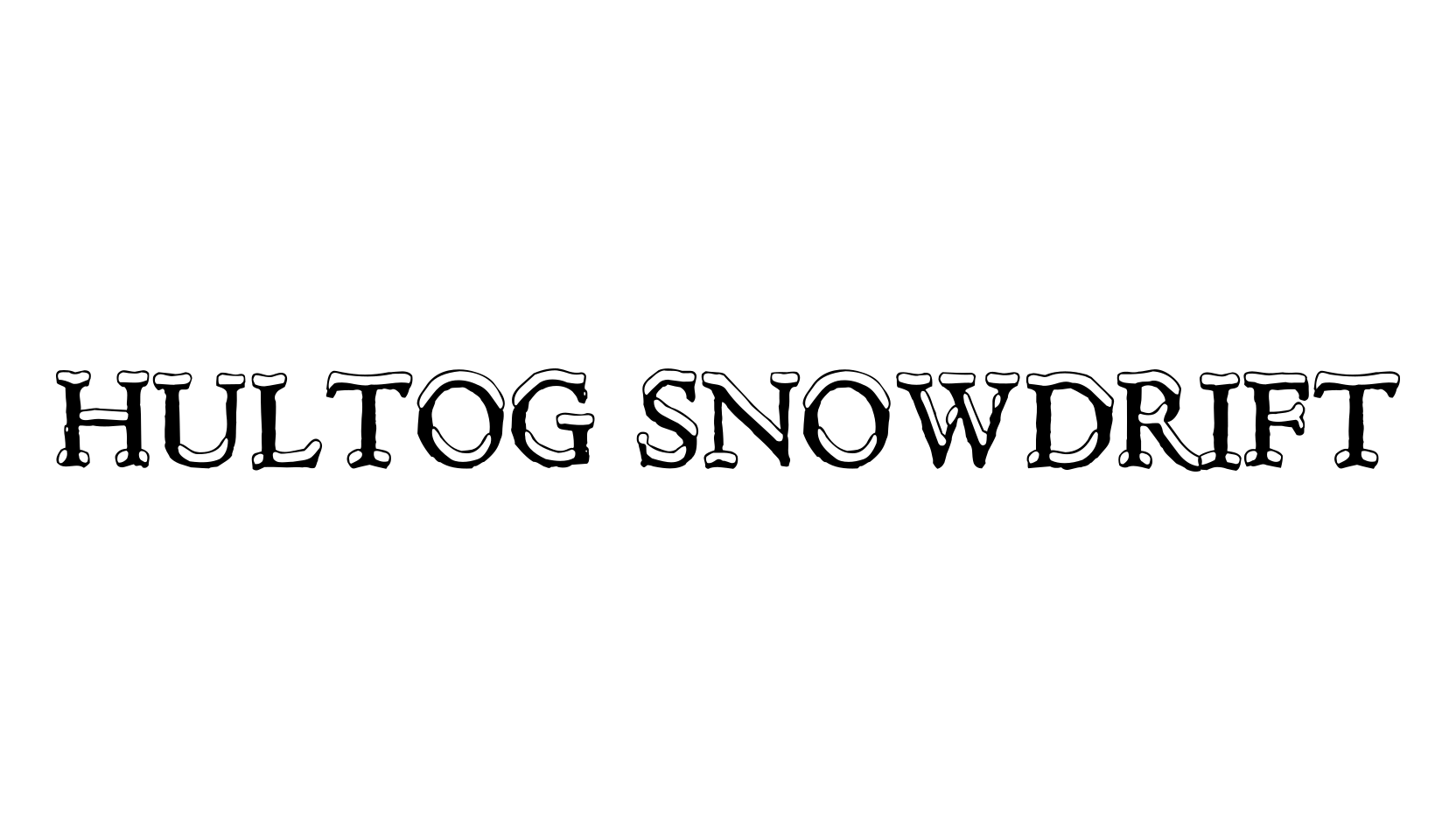
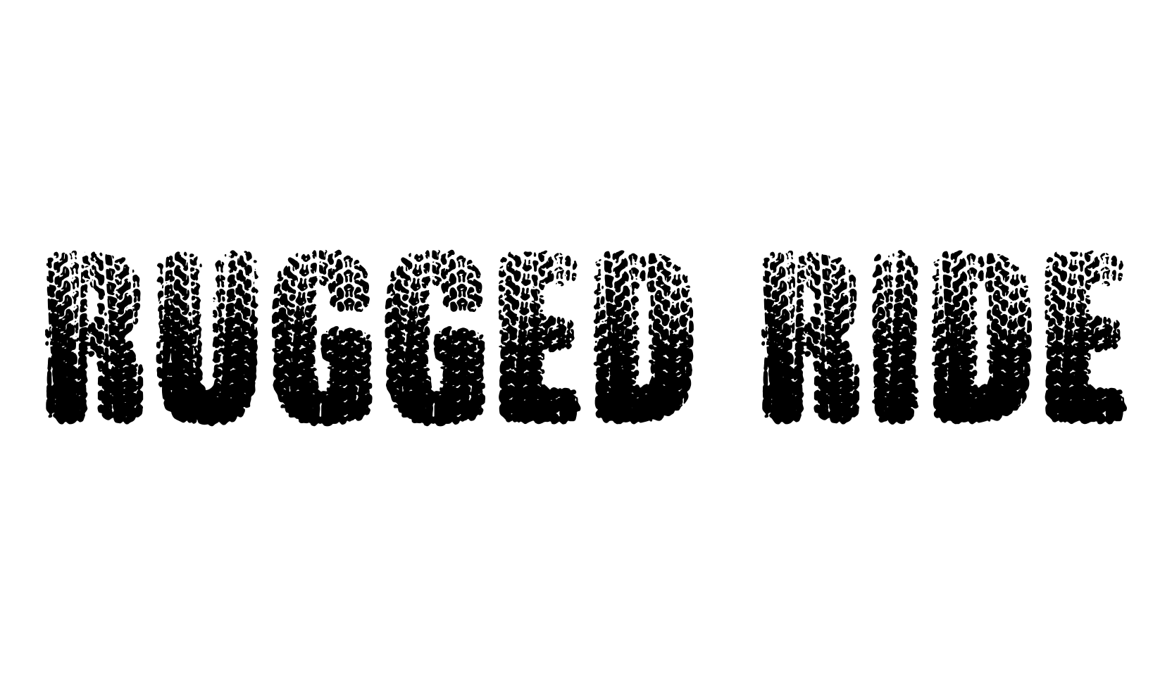
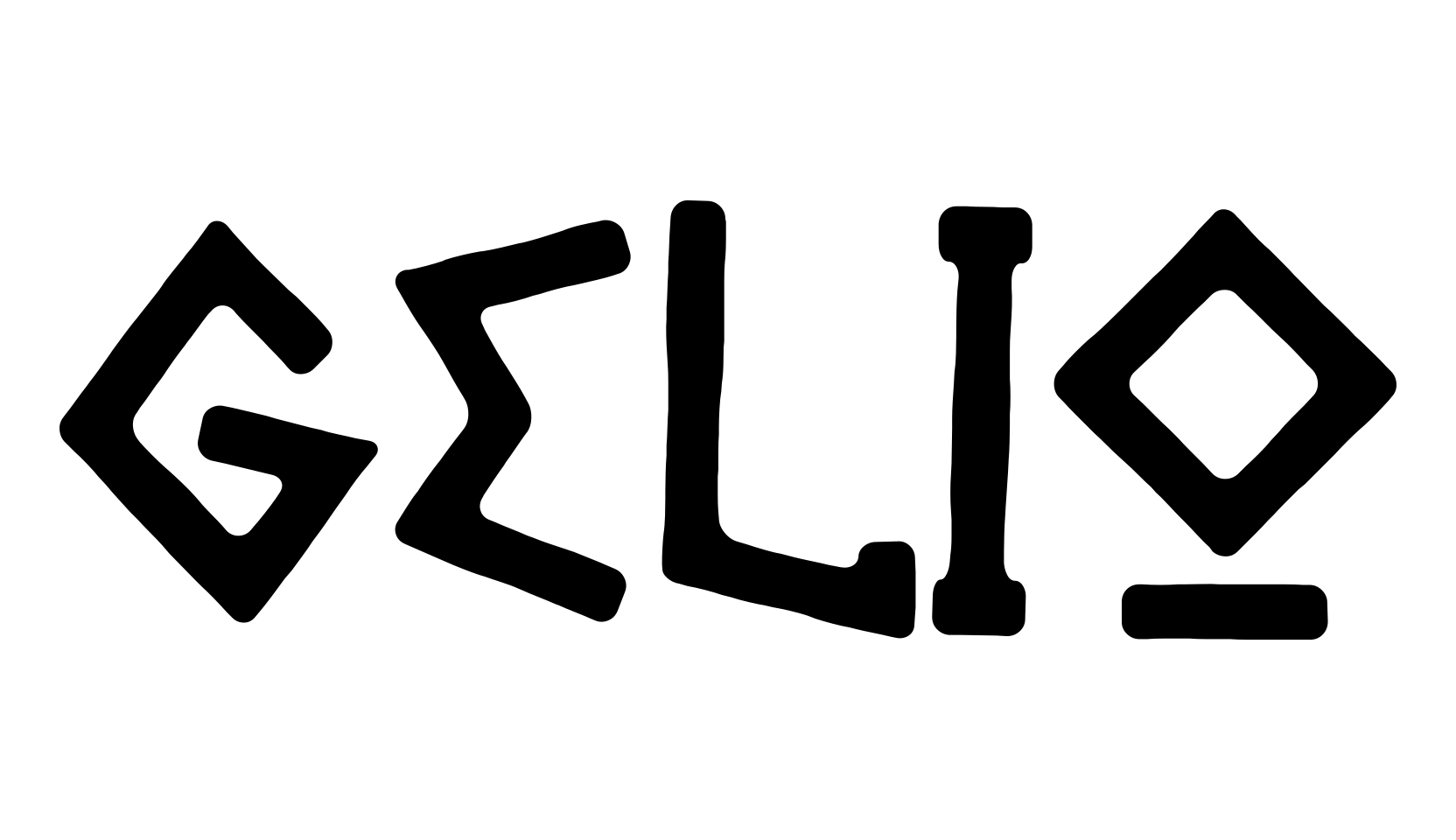
This one doesn't have a complicated origin story.
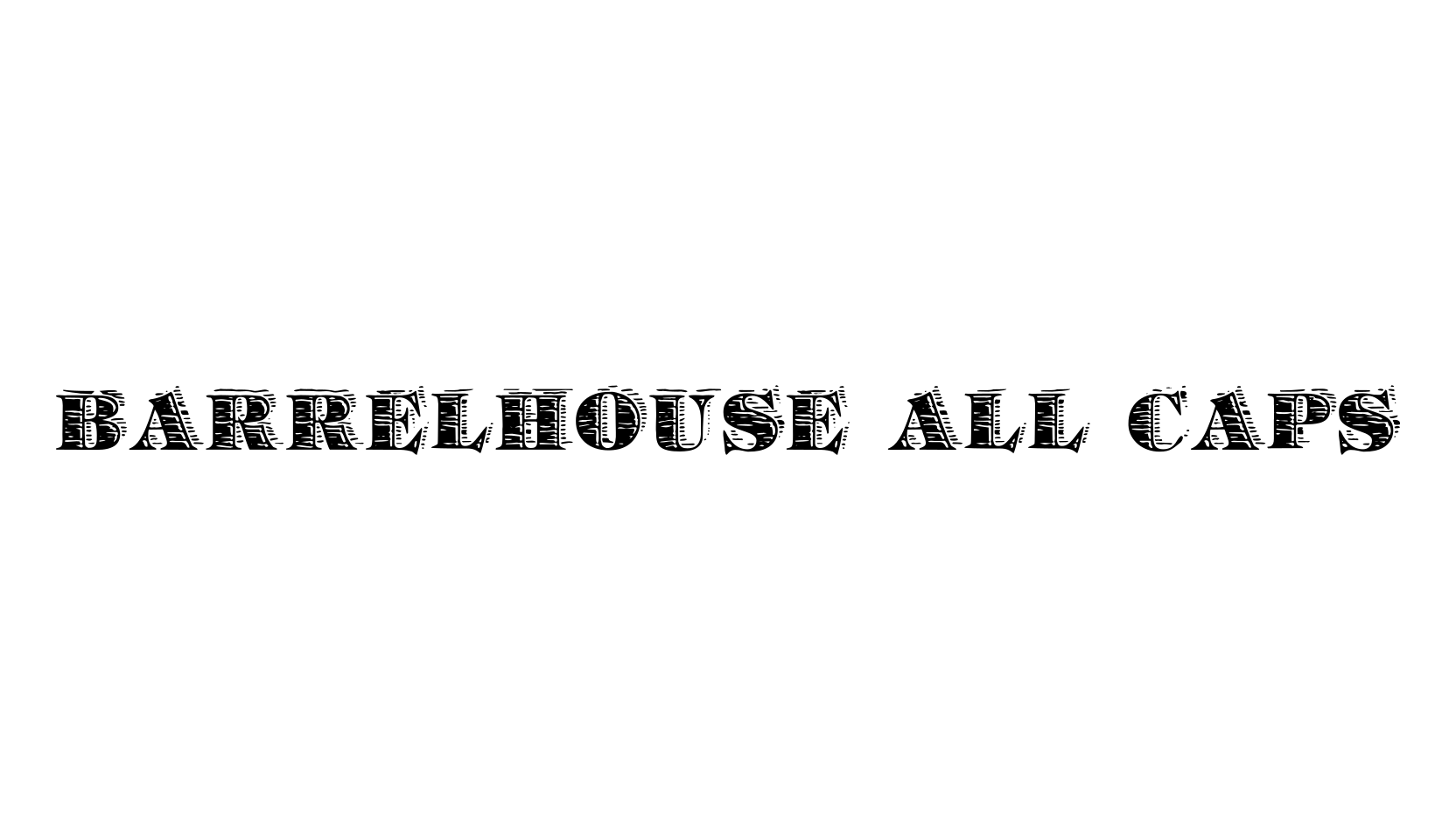
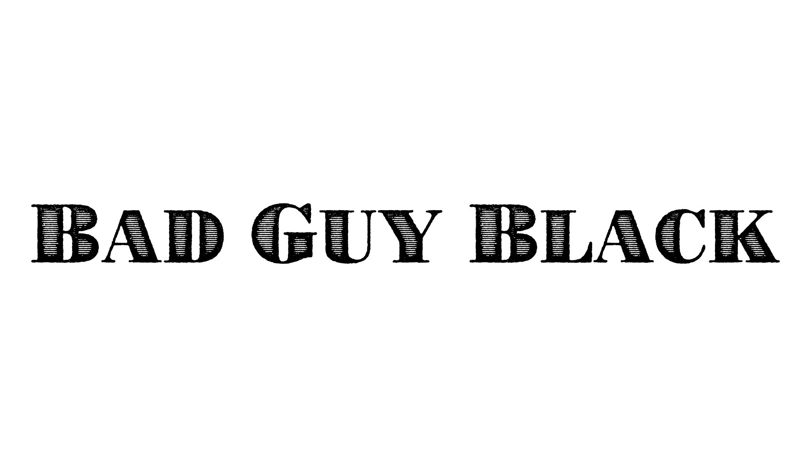
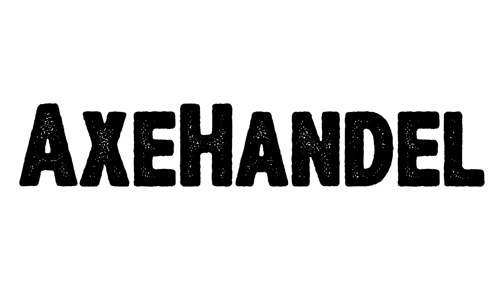
I love the warm stressing on my Dirty Headline /search?q=Dirty Headline font, and I wanted to create a brother-font for it; similarly stressed but with an alternate style, for some mixed graphics.
For the base forms, I went to one of my favorite fonts from the 1920s, and dipped it in the same acid-pit (or rather, a very similar one) as DH.
The main differences are less stressing on the outlines, a bit more texture and "resolution," and less vertical precision; this one hangs looser on the baseline.
Other than that, it's your basic full-keyboard small-caps set with one or two of the usual extras (Euro, Cent, Pound Sterling, etc).