The Seduction of the Hero Specimen
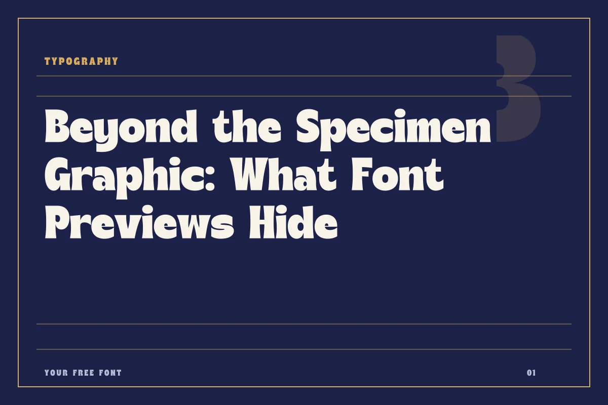
Browsing through specimen graphics is one of the most enjoyable parts of visual research. Type designers and specimen artists invest considerable effort into making sample graphics look breathtaking. High-contrast color palettes, poetic pangrams, generous leading, and carefully balanced tracking combine to display an alphabet under ideal studio lighting. When you browse the catalog at /fonts, these graphics quickly communicate mood, genre, and visual flavor.
Yet a specimen card is essentially a curated portfolio piece rather than an objective technical audit. It shows what a typeface can achieve when every single variable is meticulously controlled by someone who already knows its idiosyncrasies. When you bring that same file into a production document with messy copy, unfamiliar character sequences, and constrained layout dimensions, the magic can evaporate quickly. Understanding the boundary between what a preview graphic demonstrates and what it obscures saves hours of frustrating redesign work later in a project.
What Preview Graphics Reveal Accurately
Preview graphics are not dishonest; they simply answer a limited set of questions. They excel at communicating silhouette, mood, and headline impact. A single hero graphic tells you immediately whether a display face like American Captain carries the bold, condensed posture required for a sports banner, or whether Countryside provides the relaxed, casual cadence suited for personal packaging or editorial notes.
In addition to silhouette, promotional previews give an honest reading of letterform proportions and extreme contrasts. You can readily judge whether ascenders and descenders are elongated or clipped, how tight the counter spaces are in heavy cuts, and whether the stroke terminals feel sharp, rounded, or rustic. For hero titles, mastheads, and single-word logotypes, the preview image provides roughly eighty percent of the stylistic information you need to make an initial selection.
The Blind Spots: Spacing and Density at Body Size
Where specimen images consistently falter is in communicating how a font behaves when dropped to twelve points or set across multiple paragraphs. Most specimen graphics are generated at large display sizes—often seventy-two points or higher. At those dimensions, loose tracking looks intentional, dramatic stroke contrasts remain legible, and optical anomalies in kerning are easy to overlook or individually adjust by hand.
When that same typeface is applied to continuous reading, structural weaknesses quickly surface. Letters with delicate hair lines can vanish on standard monitors or low-resolution paper. Tight counterforms that look punchy in a poster can fill in and turn murky when set as running text. Furthermore, a clean sans like Trench might look perfectly balanced in a single title string, but its rhythm over three consecutive paragraphs of body text depends entirely on built-in sidebearings that no static graphic can demonstrate for your specific sentence structures.
The Hidden Trap of Missing Glyphs and Punctuation
Perhaps the most frequent headache designers encounter when moving from preview image to live document is the missing character set. Specimen graphics routinely rely on classic Latin phrases or carefully selected pangrams that bypass uncommon letters, diacritics, localized punctuation, and mathematical symbols. A specimen card rarely features curly quotation marks, em dashes, ampersands, or accented letters like acute and grave marks unless the creator purposefully highlights international language support.
If your project involves international names, foreign language translations, or dense editorial text with numbers and parenthetical citations, a preview image tells you nothing about whether those glyphs actually exist in the font file. Finding out halfway through layout production that a typeface lacks smart quotes, currency signs, or Spanish inverted question marks forces you either to synthesize substitutions awkwardly or rebuild the composition with an entirely different family.
A Five-Point Evaluation Checklist for Live Files
Before committing any new typeface to a client deliverable or major template, download the package and subject it to a quick hands-on verification process in your design application. Never rely solely on marketing graphics. Follow this baseline inspection routine:
- Inspect the character map for standard punctuation, quotation marks, and accented vowels required by your target audiences.
- Set a dense paragraph of fifty to seventy words at body sizes between ten and fourteen points to check natural rhythm and legibility.
- Test awkward character pairings such as uppercase T, V, and W against lowercase round letters to evaluate built-in kerning tables.
- Switch between available weights to confirm that optical consistency remains stable across the family hierarchy.
- Review the specific licensing documentation attached to the file to confirm whether commercial use is permitted.
Checking Rights and Setting Up Realistic Tests
Licensing terms are another crucial detail that no specimen artwork can convey. A font might look polished and complete, but its terms of distribution could be limited to personal exploration, educational projects, or non-commercial study. Never assume that availability implies unrestricted commercial permission. Always visit the individual release page on /fonts and review the designer terms linked directly on that entry before deploying the typography across public-facing branding, merchandise, or client websites.
Specimen graphics remain an invaluable discovery tool for browsing through thousands of typographic styles. Treat them as an invitation to investigate rather than a final stamp of approval. Once a preview catches your eye, download the files, run your own specimen tests with real production copy, and verify the character set early. That simple discipline transforms font selection from an unpredictable gamble into a reliable design practice.